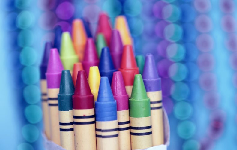
If you’re like most people, you are subconsciously influenced by color. Psychologists have long known that color has a strong impact on mood and is a driving force behind behavioral and decision-making processes. Advertisers are aware of this too, and use color to their advantage when promoting products and services. Opinions vary on just how strongly color influences purchases; some surveys have shown color to be the primary motivator in 85 percent of buying decisions and at least a partial factor 93 percent of the time, though personal reactions are highly subjective. Regardless, color does play a significant role in purchasing decisions and brand perception.
Advertisers rely on certain generalities regarding color and mood when it comes to selling products:

Red
denotes excitement, passion, and urgency. It causes physical reactions such as increased heart rate and blood pressure and is an appetite stimulant, making it a popular choice for restaurants. Brands that utilize red include Coca-Cola, Target, Chick-fil-A, Heinz, and Netflix.

Blue
is associated with peace, tranquility, and water. It ranks as the favorite color of both men and women. Blue curbs the appetite and increases productivity, which explains its appeal in office environments. It helps promote security and trust and fosters a sense of loyalty. IBM, Ford, General Electric, Facebook, and American Express all use blue.

Yellow
is a cheerful color that represents optimism, youth, and clarity. It is mentally stimulating and the first color that most babies react to. Because it’s an attention-grabber it can result in impulse purchases, but should be used judiciously because too much can create anxiety. Popular brands that use yellow include Nikon, McDonald’s, IKEA, Post-It, and Ferrari.

Green
signifies health, tranquility, nature, and serenity. Its association with the environment is used to appeal to ecologically-minded consumers who feel strongly about protecting the planet’s natural resources. Green promotes relaxation and eases feelings of depression. It is the color of choice for brands such as Whole Foods, Spotify, John Deere, Starbucks, and Land Rover.

Orange
is associated with warmth, enthusiasm, and excitement. It denotes cheerfulness and confidence but can also provoke a sense of caution. Like yellow, it’s good at triggering impulse purchases and is viewed as promoting affordability and value. Brands that use orange include Amazon, Home Depot, Nickelodeon, Harley Davidson, and Crush.

Purple
is the color of royalty, wisdom, wealth, and success. It stimulates creativity and is popular for cosmetic, beauty, and anti-aging products. Luxury brands prefer purple over any other color, but too much can prove distracting. Purple is utilized by brands such as Yahoo, Hallmark, Cadbury, FedEx, and Taco Bell.

Black
is associated with power, sophistication, stability, and mystery. It denotes intelligence and is often used by companies whose products are sleek and upscale. Too much black can overwhelm the senses and create feelings of negativity or oppression, so it’s best used in subtle ways. Adidas, Chanel, Disney, Apple, and Gucci are all brands that emphasize black.

White
is a neutral color that represents purity, cleanliness, and safety. It is an excellent way to add contrast and open space and is utilized by advertisers to promote coupons and discounted prices. Its stark clarity and freshness represent a clean slate ideal for sparking creativity. Brands that use white include Jeep, Nintendo, Uber, Microsoft, and Google.
With colors playing such a pivotal role in the consumer’s mind, it pays to give some serious thought to the emotions you are striving to invoke when creating an advertising campaign. Keep in mind that there are always exceptions to the established “rules,” however; for every psychologist who claims that blue is an appetite suppressant, there is a White Castle executive who would argue otherwise. The most important factor to consider when choosing a color is to base your decision on the personality you want to project for your brand rather than stereotypical color preferences.


